Hello all, its been all of about a week since i released my last skin and guess what??? (Thats right Tayla, have another one to show off!! lol)
Some screen shots for you - still in development so please dont message me and ask me to send it to you. This one may take longer to code as it is the first one i have done with pannels. As soon as it is complete i will post it for everyone to use.
There are a few screenshots showing the different pannels i have included. Quite a few people have mentioned that they like my previous skins but they have all been aimed at video jocks. So this time you can have the best of both worlds and set it up to meet you personal requirements.
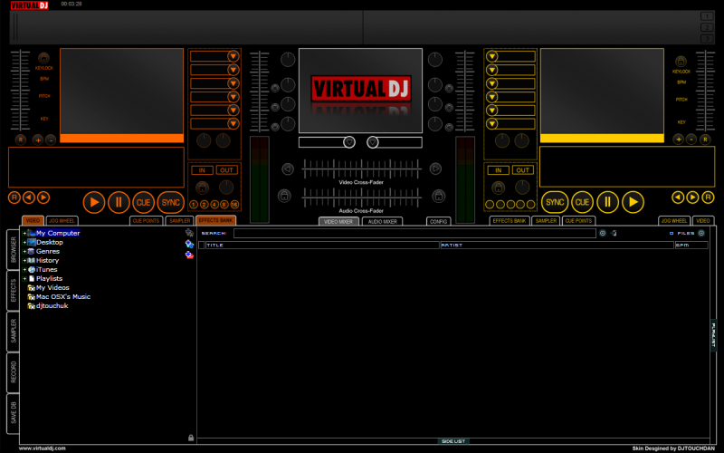
Also playing with some different colours other than the standard blue and red. Try orange and yellow this time round - let me know your thoughts - i think it works quite well.
Anyway enough of me talking - heres the screenshots:
Overview:
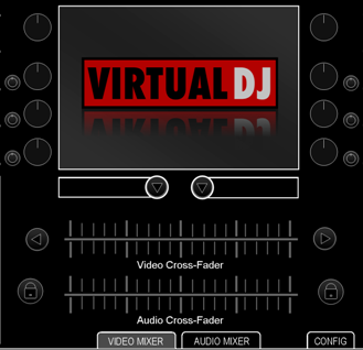
Video Mixer (close-up)
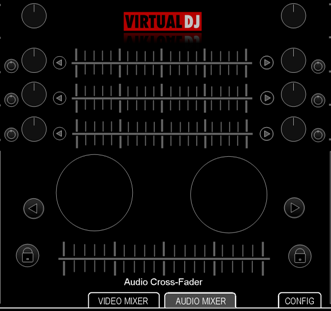
Audio Mixer (close-up) with EQ crossfaders (as requested)
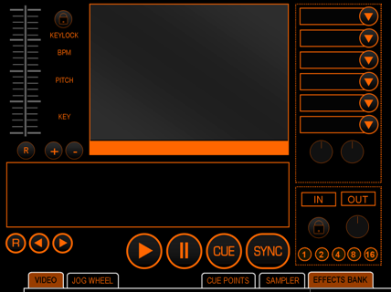
Deck with Effects Pannel (compatible with Hercules RMX and Steel)
Deck with Sampler Bank (not tested the fundtionality of this yet - but the theory works)
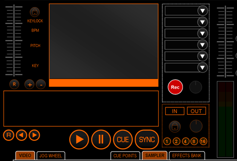
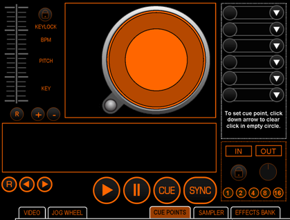
Deck with Cue Points & RMX Jog Dial replacing the Video Screen
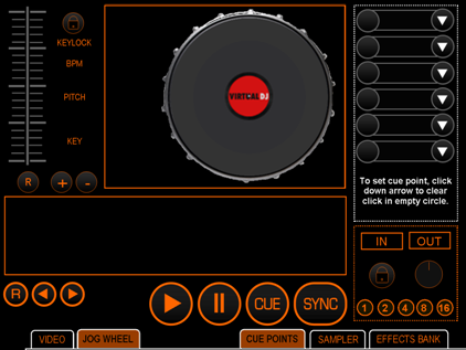
Deck with Numark Style Roatation replacing Video
Feel free to post your comments and views.
Some screen shots for you - still in development so please dont message me and ask me to send it to you. This one may take longer to code as it is the first one i have done with pannels. As soon as it is complete i will post it for everyone to use.
There are a few screenshots showing the different pannels i have included. Quite a few people have mentioned that they like my previous skins but they have all been aimed at video jocks. So this time you can have the best of both worlds and set it up to meet you personal requirements.
Also playing with some different colours other than the standard blue and red. Try orange and yellow this time round - let me know your thoughts - i think it works quite well.
Anyway enough of me talking - heres the screenshots:
Overview:

Video Mixer (close-up)

Audio Mixer (close-up) with EQ crossfaders (as requested)

Deck with Effects Pannel (compatible with Hercules RMX and Steel)

Deck with Sampler Bank (not tested the fundtionality of this yet - but the theory works)

Deck with Cue Points & RMX Jog Dial replacing the Video Screen

Deck with Numark Style Roatation replacing Video

Feel free to post your comments and views.
Posted Mon 23 Feb 09 @ 6:19 pm
Do u have a button anywhere to choose active deck?? For cueing and such. Didnt see it on the Touch skin.
Posted Mon 23 Feb 09 @ 7:25 pm
Yes - it is included in this skin.
For some reason they are not showing in these screen shots but they are on both mixer pannels below the bass EQ knob for each deck respectively.
For some reason they are not showing in these screen shots but they are on both mixer pannels below the bass EQ knob for each deck respectively.
Posted Mon 23 Feb 09 @ 7:31 pm
Ooooh Yeah!!
Very nice mate, this one I am going to follow very closely..
Orange is my favorite color by the way so I love it!
Keep up the good work Dan, and thanks for the EQ crossfaders :)
Edit- Even after 10 minutes of staring at all the pics I can't find anything I don't like or can't do with this skin.
Matt.
Posted Mon 23 Feb 09 @ 10:01 pm
Nice design.
I like the buttons for changing pannels, they look like tabs and are perfectly integrated.
Keep up the good work.
I like the buttons for changing pannels, they look like tabs and are perfectly integrated.
Keep up the good work.
Posted Tue 24 Feb 09 @ 3:53 am
djtouchdan wrote :
Try orange and yellow this time round - let me know your thoughts - i think it works quite well.
Yes, I think the colours work good mate, it's about time we have some different colours, hehe

I do like these "Cue" style windows, and they also look good in this colour too
Thumbs up from me Dan mate.
Posted Tue 24 Feb 09 @ 5:08 am
Hey Jimmy,
It's getting there, having some issues coding the rotating pannels (Jog Wheel and Numark) other than that it's coming along. Keeps display the base pannel through the clip mask - so annoying.
Got a day off work tomorrow so should get some more done.
Hope your well.
It's getting there, having some issues coding the rotating pannels (Jog Wheel and Numark) other than that it's coming along. Keeps display the base pannel through the clip mask - so annoying.
Got a day off work tomorrow so should get some more done.
Hope your well.
Posted Thu 26 Feb 09 @ 4:11 pm
djtouchdan wrote :
Hope your well.
Hope your well.
Yeah, pretty good mate, last early start for the week. Roll on 2pm :)
I'm quite looking forward to this one mate.
Posted Thu 26 Feb 09 @ 11:57 pm
Dan I got some ideas to add for the skin I am askin ya to build and we could use this one as the base, get back to me:)
Posted Fri 27 Feb 09 @ 12:24 am
discob - just private message me your ideas, i did get your last one, just havent had time to send a reply.
All sounds good to me though.
All sounds good to me though.
Posted Fri 27 Feb 09 @ 6:18 am
ok, this is proving sooooo complicated. upto 1500lines of code and not even half way through. I have solved the problems with the rotating graphics but only by creating a graphics for each turn in the rotation - if that makes sense. Just need to fine tune it now and that part should be fine.
who's idea was it to create a pannled skin???...............dam it, that would be me then!! lol
more updates and screenshots coming soon as there have been some changes to the previous shots - nothing major though.
who's idea was it to create a pannled skin???...............dam it, that would be me then!! lol
more updates and screenshots coming soon as there have been some changes to the previous shots - nothing major though.
Posted Fri 27 Feb 09 @ 6:22 am
Ok as i am working most of the weekend i thought i'd post a couple more screenshots to keep you all amused.
Updated overview - only Deck A programmed so far. (well partially programmed anyway)
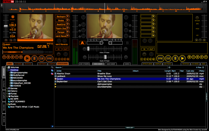
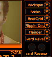
Effects bank (compatible with Hercules RMX & Steel)
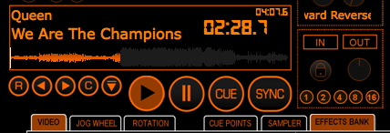
Main display with song position wave form (personally i think it looks great). Also added "Clone" and "Eject" buttons.
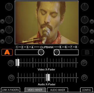
Video mixer - added clipbank shortcuts and the "Deck Select" option (Deck Select is also on audio mixer but i didnt worry with a screen shot of that as i havent even touched it)
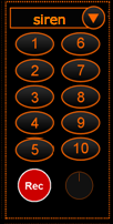
Redesign of sampler unit - mainly because it doesnt seem to work in the same was as the effects and you cant have slots with it (someone please correct me if i'm wrong). The only issue i'm having is the buttons do not stay highlighted when effect playing. The button triggers the effect fine but doesnt stay illuminated.
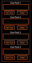
Redesign cue pannel - just to make it easier and clearer - cue easy to use cue point per deck.
The extremely painful jog wheel - hours of graphic design and coding - not quite there yet which is why it looks a bit rough round the edges. The best thing about it - the entire jog turns like a platter!! lol

Anyways - post your comments.
Dan
Updated overview - only Deck A programmed so far. (well partially programmed anyway)

Effects bank (compatible with Hercules RMX & Steel)

Main display with song position wave form (personally i think it looks great). Also added "Clone" and "Eject" buttons.

Video mixer - added clipbank shortcuts and the "Deck Select" option (Deck Select is also on audio mixer but i didnt worry with a screen shot of that as i havent even touched it)

Redesign of sampler unit - mainly because it doesnt seem to work in the same was as the effects and you cant have slots with it (someone please correct me if i'm wrong). The only issue i'm having is the buttons do not stay highlighted when effect playing. The button triggers the effect fine but doesnt stay illuminated.

Redesign cue pannel - just to make it easier and clearer - cue easy to use cue point per deck.

The extremely painful jog wheel - hours of graphic design and coding - not quite there yet which is why it looks a bit rough round the edges. The best thing about it - the entire jog turns like a platter!! lol

Anyways - post your comments.
Dan
Posted Fri 27 Feb 09 @ 5:34 pm
Hey Dan, great work mate.
I have one suggestion that you are probably too far in to consider but I will put it forward anyway.
Is there any chance of having another optional layout for the effects window which matches the layout of the rmx/steel, as opposed to six effects slots on top of each other have 2 columns of 3.
Similar to this skin..
http://www.virtualdj.com/addons/6294/Denon_Rmx.html
Hope that made sense??
Cheers Dan.
Matt.
Posted Sat 28 Feb 09 @ 1:09 am
Bloody good work Dan!!!!!
Posted Sat 28 Feb 09 @ 2:57 am
fattmatt1972 wrote :
Hey Dan, great work mate.
I have one suggestion that you are probably too far in to consider but I will put it forward anyway.
Is there any chance of having another optional layout for the effects window which matches the layout of the rmx/steel, as opposed to six effects slots on top of each other have 2 columns of 3.
Similar to this skin..
http://www.virtualdj.com/addons/6294/Denon_Rmx.html
Hope that made sense??
Cheers Dan.
Matt.
I have one suggestion that you are probably too far in to consider but I will put it forward anyway.
Is there any chance of having another optional layout for the effects window which matches the layout of the rmx/steel, as opposed to six effects slots on top of each other have 2 columns of 3.
Similar to this skin..
http://www.virtualdj.com/addons/6294/Denon_Rmx.html
Hope that made sense??
Cheers Dan.
Matt.
Nice idea although for this one it was aimed as a general use but integrating the 6+6 and 12+12 buttons for the RMX and Steel respectively rather than specifically at a controller.
I will however look into but feel maybe in version 2 as to be able to do it in this one would mean jiggling around alot of other things.
Never the less thanks for the input and i will bare it all in mind.
jimmy b wrote :
Bloody good work Dan!!!!!
Bloody good work Dan!!!!!
Glad you like.....
Posted Sun 01 Mar 09 @ 6:10 pm
Sounds good.
I will still be using this skin (soon I hope:)) regardless because I like the whole setup/color scheme.
Awesome work mate.
Matt.
I will still be using this skin (soon I hope:)) regardless because I like the whole setup/color scheme.
Awesome work mate.
Matt.
Posted Mon 02 Mar 09 @ 2:24 am
This looks like it may be the new weapon of choice!
Colour are nice too!
As requested on your previous skin, is there a place where it can show which loop length will be used if you just activate loop?
Can't wait for this bad boy.
Ross
Colour are nice too!
As requested on your previous skin, is there a place where it can show which loop length will be used if you just activate loop?
Can't wait for this bad boy.
Ross
Posted Mon 02 Mar 09 @ 9:14 am
DJ Ross M wrote :
This looks like it may be the new weapon of choice!
Colour are nice too!
As requested on your previous skin, is there a place where it can show which loop length will be used if you just activate loop?
Can't wait for this bad boy.
Ross
Colour are nice too!
As requested on your previous skin, is there a place where it can show which loop length will be used if you just activate loop?
Can't wait for this bad boy.
Ross
Yes it will be in the display pannel - alongside title/artist etc.
Posted Mon 02 Mar 09 @ 9:23 am
What size is this skin?
Posted Wed 04 Mar 09 @ 2:38 pm
1280x800 by default but may look at an alternative if demand is there.
Am actually working on a slight re-design to include some requests people have sent me - in principal its the same but just rearranged things. Will post some screenshots when i'm happy with it.
Am actually working on a slight re-design to include some requests people have sent me - in principal its the same but just rearranged things. Will post some screenshots when i'm happy with it.
Posted Wed 04 Mar 09 @ 2:47 pm


