great looking skin again dan cant wait to give it a test drive with my toy
Posted Thu 05 Mar 09 @ 11:15 am
A few updated screenshots for you...... (please excuse the font sizes - they are windows fonts being displayed on a Mac so dont quite look right)
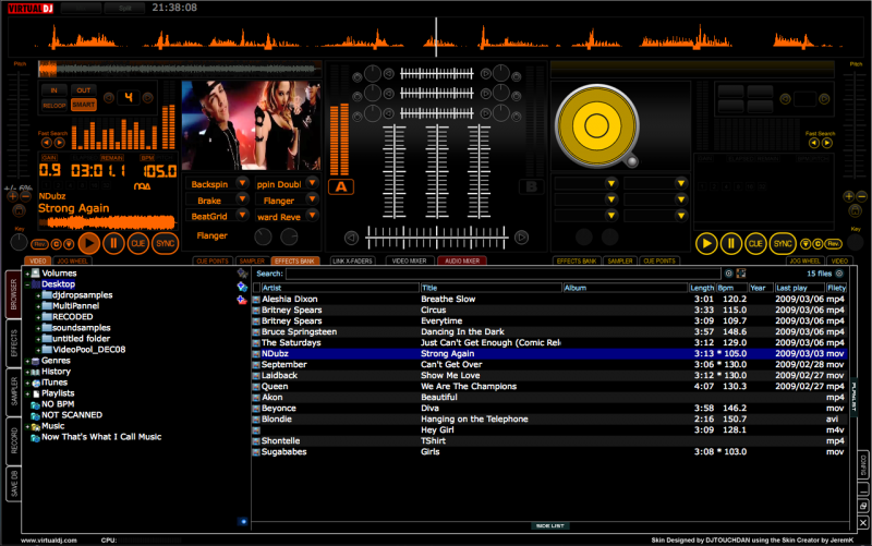
Main over view - CONFIG, CLOSE, MAXIMIZE, MINIMIZE etc now in bottom right hand corner.
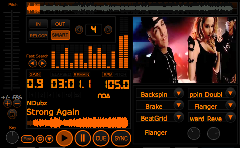
Close up of Deck A - now with the effects bank to fit more with Hercules RMX & Steel (as requested)
Key changer | Graphic EQ style Visual | Track Skip Buttons | 2 x Song position (only 1 with cue points etc)
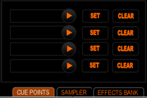
Updated cue points unit - much simpler - does exactly what it says on the tin
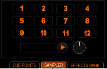
Updated sampler unit - and i have figured out how to keep the buttons highlighted when selected.
Main over view - CONFIG, CLOSE, MAXIMIZE, MINIMIZE etc now in bottom right hand corner.

Close up of Deck A - now with the effects bank to fit more with Hercules RMX & Steel (as requested)
Key changer | Graphic EQ style Visual | Track Skip Buttons | 2 x Song position (only 1 with cue points etc)

Updated cue points unit - much simpler - does exactly what it says on the tin

Updated sampler unit - and i have figured out how to keep the buttons highlighted when selected.

Posted Sun 08 Mar 09 @ 4:53 pm
Ooh yeah baby!
You have had a busy weekend.
That looks absolutely fantastic Dan, and I love the reconfigured effects window:)
I know I have said it before but the orange and yellow looks awesome.
Your making me drool...
Very, very nice work mate,
Matt.
You have had a busy weekend.
That looks absolutely fantastic Dan, and I love the reconfigured effects window:)
I know I have said it before but the orange and yellow looks awesome.
Your making me drool...
Very, very nice work mate,
Matt.
Posted Sun 08 Mar 09 @ 5:07 pm
dan
that looks absolutely awesome !!
so glad you got back early over the weekend now, so feel free to take the rest of the night off lol !!
great work its superb
aubs
that looks absolutely awesome !!
so glad you got back early over the weekend now, so feel free to take the rest of the night off lol !!
great work its superb
aubs
Posted Sun 08 Mar 09 @ 5:23 pm
Hehe, I just noticed the keychanger!
And 1 minute later the 2,4,8,16,32 loop lights under the gain/remain, what hasn't this thing got...
Nice touch.
Matt.
And 1 minute later the 2,4,8,16,32 loop lights under the gain/remain, what hasn't this thing got...
Nice touch.
Matt.
Posted Sun 08 Mar 09 @ 8:02 pm
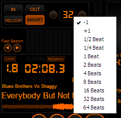
Just added a drop down menu for loop length - simply rightclick to bring up the options the left click to activate!

Posted Sun 08 Mar 09 @ 8:09 pm
Now your just showing off ;)
I like it.
How do you think it would look if you used (orange left/yellow right) as a background color for the loop menu you just showed me?
I think it would look cool..
Matt.
I like it.
How do you think it would look if you used (orange left/yellow right) as a background color for the loop menu you just showed me?
I think it would look cool..
Matt.
Posted Sun 08 Mar 09 @ 8:18 pm
Thinking about my above statement, then you might need a border to offset it from the skins colors.
Just an idea, you seem to have it well in hand :)
Matt.
Just an idea, you seem to have it well in hand :)
Matt.
Posted Sun 08 Mar 09 @ 8:26 pm
I like the idea but am pretty sure it isn't possible as it takes the background and font information from the operating system rather than virtual dj.
Posted Sun 08 Mar 09 @ 8:36 pm
I see where your coming from.
Matt.
Matt.
Posted Sun 08 Mar 09 @ 8:39 pm
how the hell have i been missing this thread, damn, looking sweet dan, glad your going with the black background... cheers
Posted Thu 12 Mar 09 @ 2:04 am
hehe, you remembered you got the orange in as well, wey hey... lol
Posted Thu 12 Mar 09 @ 2:13 am
Guys,
Thanks for your continued support on this one - i havent forgotton it. Been a bit under the weather over the past few days and not upto sitting infront of a screen and concentrating! lol
Tayla - nice to know you approve.
Hopefully i will get some more done over the weekend - and who knows maybe get it to a beta testing stage (no promises though).
RMX Style Jog?? - no one seems to have noticed i removed this from the last few screenshots. Not because i dont want to include it - but mainly because graphically it is quite challengeing as i want the whole jog to turn. This is complicated by the fact it is in a pannel which in short means i have to create 36identical images and the spin each one by 10degrees more than the last lol.I do want to include it but may get the rest of the skin to beta then work on that a bit more.
Anyway - HAPPY THURSDAY everyone - lol
Posted Thu 12 Mar 09 @ 4:35 am
Hope you feel better soon Dan.
Jog wheels, meh...Bit of a non event for me, too many other cool things going on to worry about that.
Matt.
Jog wheels, meh...Bit of a non event for me, too many other cool things going on to worry about that.
Matt.
Posted Thu 12 Mar 09 @ 6:13 am
under the weather.... must be one of those southern sissy things... lol
Posted Thu 12 Mar 09 @ 1:41 pm
rmx jogs on it who needs them anyway. just thought they might have been hidden on another panel lol !!
I'm with matt on that one prefer to have the nice big panels with all the info we need being clear and visible
get better soon
I'm with matt on that one prefer to have the nice big panels with all the info we need being clear and visible
get better soon
Posted Thu 12 Mar 09 @ 2:18 pm
cant wait for this one man
hoping for 1440 by 900 :)
hoping for 1440 by 900 :)
Posted Sun 15 Mar 09 @ 6:46 pm
Hello to all, when it completed the work of this fantastic skin?
Posted Mon 16 Mar 09 @ 2:26 am
Hello, Bonjour, Hallo and all that jazz.
Just so you know i havent forgotton this one - got a couple of days off now and one early next week so should have it finished very soon! an making some real progress with it but it is just taking time because of the pannels.
Thanks to all of you for your input and i will post it up on the site as soon as it is finished.
Thanks
Dan
Posted Thu 19 Mar 09 @ 9:08 pm
soopa doopa
Posted Fri 20 Mar 09 @ 3:34 am


