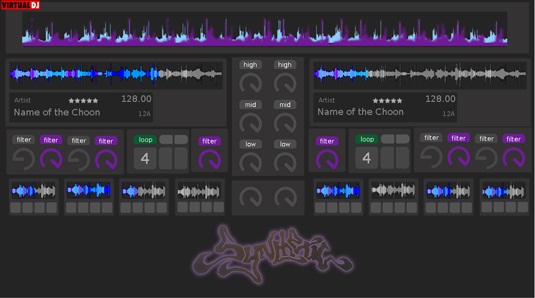
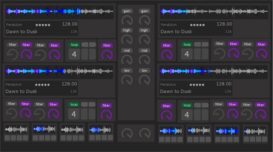
started thinking of ideas and came up with this... it's a very minimal onscreen display but looks kinda cool... it's only netbook size for the rough draft.


Posted Fri 20 Apr 12 @ 10:37 am
Looks pretty cool Andrew !
Posted Fri 20 Apr 12 @ 11:38 am
Looks cool ;o)
Posted Fri 20 Apr 12 @ 11:47 am
Love the colours dude :)
Keith
Keith
Posted Fri 20 Apr 12 @ 11:57 am
That there is a whole lot of filters!
Very Ableton in style too. Me likey.
Very Ableton in style too. Me likey.
Posted Fri 20 Apr 12 @ 3:11 pm
Thanks for the feedback guys, glad you like it :-)....
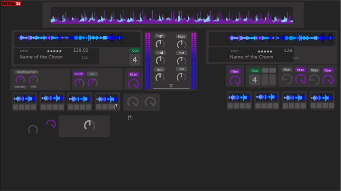
wondering if I can ask your opinion in the knobs, there is three sizes there and not sure which to move forward on, but I'm leaning towards the oversized ones from the original draft...
Also @djdad/atomix, should I be using vector graphics for the knob rotation? last time I just used 1 and rotated it then copied all layers to saved a bit of time, but if thiings are supposed to be resizable so im not sure if it matters or not, and last what is the best size to make it in for resizing in vdj8, this is 1366x768 would it be better in 1080p?...

Posted Sat 21 Apr 12 @ 12:51 am
This skin is no longer being worked on. Thread locked as requested by Synthetic
Keith
Keith
Posted Mon 23 Apr 12 @ 3:15 pm


