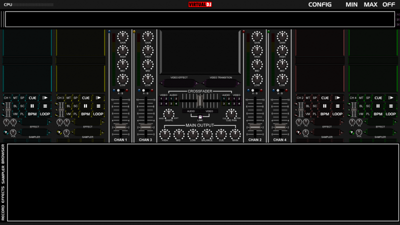
Ok, I went to the drawing table and started from scratch again. I wanted to make a skin that felt a little more MIXER centered and less DECK centered. after all, the \"DECKS\" that we are using when utilizing this software is a mouse and a keyboard or some other external controller.
So I modeled this by starting with a picture of the old-school Rane MP-44 and just started completely from scratch.
I am toying around with the idea of putting the video screens on pannels and having them swap out with scratch screens?
I\'m also torn on which screen (top or bottom per controller) to place the video preview and which one should hold the song data display.
I\'m the thinking the top \"screen\" on each controller should be the video preview to tie it in visually across the top with the main video window.
Opinions? Thoughts? Am I missing an element or control that you would like to see?
Please, your input will be appreciated.
DjChuck
CB Graphix

Posted Tue 18 Jan 11 @ 3:50 am
well, first of all a sampler is not deck-oriented. Samplers are universal, and are not enslaved to 1 deck, so 16 samplers? It is limited to 12 last time i checked. Also for the loops, you might want to add a slider and textzone to change the lenth of the loop, and say what lenth the loop is, other than that, its good to go!
Posted Tue 18 Jan 11 @ 4:08 pm
Well, you can actually assign a sample to each deck. You still use the bank of 12 but you can trigger a seperate sample from each deck...
ie.
<button action="deck 1 sampler select">
...
...
...
</button>
<button action="deck 1 sampler play">
...
...
...
</button>
You make a good point about the loop functions. I will re-design it, i though a tap loop would be sufficient.
DjChuck
ie.
<button action="deck 1 sampler select">
...
...
...
</button>
<button action="deck 1 sampler play">
...
...
...
</button>
You make a good point about the loop functions. I will re-design it, i though a tap loop would be sufficient.
DjChuck
Posted Tue 18 Jan 11 @ 11:17 pm
Lets suppose a sampler is deck oriented. Its better to put 3 samplers rather than 4 due to the fact tht if you do 16, at least 1 sampler will have to pop-up twice. And there is no point in that. Then again 3 samplers will alter your layout. Also, bottom screen and top song info would be better, and why not make the scratch pannel? Aldo where are your VU-Meters? I suggest putting them next to each deck's EQ and volume slider.
Posted Sat 22 Jan 11 @ 10:01 pm
ahh, I understand the confusion now... the 4 boxes you're reffering to are the beatkeeper indicators. The sampler window is the one above the text, not below.
I can see how you would think that though from the picture.
I can see how you would think that though from the picture.
Posted Sun 23 Jan 11 @ 2:55 am
OOOOHHHHHH. I got you now on the samplers. You should make it clearer on which is which. Yet still, add the VU-meters.
Posted Sun 23 Jan 11 @ 1:50 pm
Have the VU meters on the mixer channels, I'm also re-designing the channel control lay-outs.. Will post when I have a draft
Posted Sun 23 Jan 11 @ 6:37 pm


