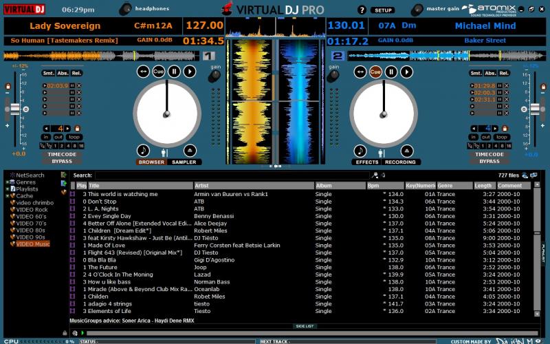
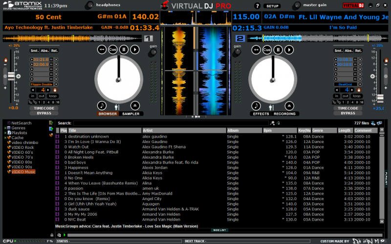
This is my first skin (scratch skin), it is not finished yet so would like some feed back (good,bad, what you would change).
The question mark at the top of the screen when clicked on brings up Scott\'s notepad app which I use as a request list reminder.
The skin also uses Scott's battery app, an icon appears at the top of the screen when you are running on battery and starts to flash at 50%.
I have also put the automix next track info at the bottom of the screen, next to status.
hope you like
Ian

Posted Wed 01 Dec 10 @ 12:42 pm
Looks nice and clean, dont like the blue though cheapens the look.
1920x1200 resolution would be appreciated when you get it finished.
1920x1200 resolution would be appreciated when you get it finished.
Posted Wed 01 Dec 10 @ 3:53 pm
can you say, the resolutions please!!! if you can to do in 1024*768
Posted Wed 01 Dec 10 @ 4:06 pm
I like It, but where is the 4 decks option?
Posted Wed 01 Dec 10 @ 5:24 pm
1280x800 at the mo going to make it in 2 more resolutions as with the EULA rules, just need to find the most common resolutions used.
As for 4 decks I am just sorting the layout for them and the colour has been changed to grey.
Will upload a new pic's this weekend.
As for 4 decks I am just sorting the layout for them and the colour has been changed to grey.
Will upload a new pic's this weekend.
Posted Thu 02 Dec 10 @ 3:09 am
please make one on 1366x768
Posted Thu 02 Dec 10 @ 7:58 am
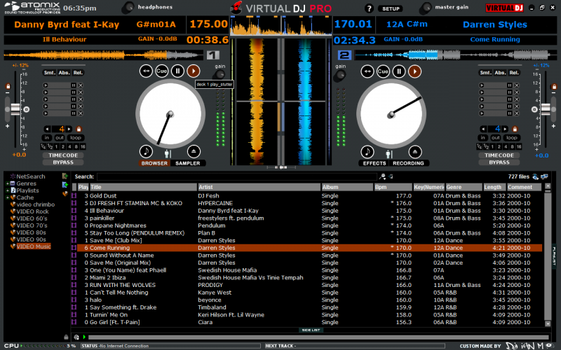
UPDATE

Posted Thu 02 Dec 10 @ 12:41 pm
a few suggestions, take them if you want:
how about thickening the lines of the jogwheels a bit. they are a bit thin
an option to toggle between the slots of the cue points and effects.
getting rid of the Virtual DJ Pro in the middle and replacing it with the Virtual DJ logo in the top right.
other than that i see where this skin is headed and it is looking fantastic
hope this constructive criticism helps =)
Posted Thu 02 Dec 10 @ 2:50 pm
Jogwheel lines are now a bit thicker.
Also you can see the two icons that come up at the top of the screen when running of battery (start to flash at 50%)
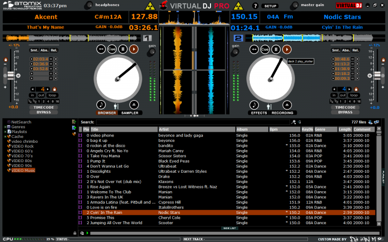
Also you can see the two icons that come up at the top of the screen when running of battery (start to flash at 50%)

Posted Fri 03 Dec 10 @ 9:53 am
nice skin dude! deff. gonna move back to 2deck mixing when this is out.
Posted Fri 03 Dec 10 @ 12:39 pm
ianmelville wrote :
Jogwheel lines are now a bit thicker.
Also you can see the two icons that come up at the top of the screen when running of battery (start to flash at 50%)

Also you can see the two icons that come up at the top of the screen when running of battery (start to flash at 50%)

I think there are too many atomix and vdj logos on the top, they ruin the pro look of the skin and cheapen it. The one on the right is sufficient.
I am a huge fan of VDJ but dont like the logos plastered averywhere...Less is more.
Posted Sat 04 Dec 10 @ 6:41 am
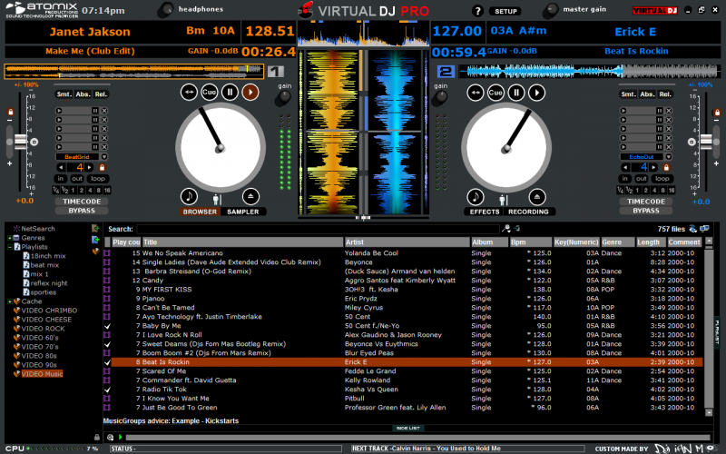
UPDATE SHOWING
Battery icons.
VDJ logo on the right a little smaller.
Audio effects selector now added under cue points.
flashing box now pops up around song position's when 30 seconds left, then flashes faster at 20 and 10 seconds left.
Battery icons on and flashing boxes on
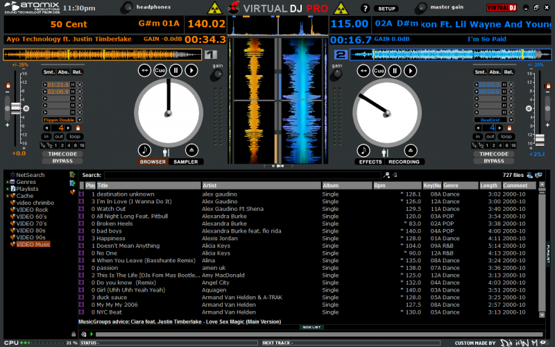
Battery icons off and flashing boxes not started yet
Battery icons.
VDJ logo on the right a little smaller.
Audio effects selector now added under cue points.
flashing box now pops up around song position's when 30 seconds left, then flashes faster at 20 and 10 seconds left.
Battery icons on and flashing boxes on

Battery icons off and flashing boxes not started yet

Posted Mon 06 Dec 10 @ 5:41 pm
How close is to being available, looking really good
Posted Tue 07 Dec 10 @ 7:39 am
Not long now
Posted Tue 07 Dec 10 @ 11:34 am
Uploaded today, just waiting for approval.

Posted Tue 21 Dec 10 @ 12:47 pm
Looks a bit like Serato and the team will knock back any skins that impersonate competitors software.
Will be interesting to see if this one passes or not :)
Keith
Will be interesting to see if this one passes or not :)
Keith
Posted Tue 21 Dec 10 @ 1:49 pm
kradcliffe wrote :
Looks a bit like Serato and the team will knock back any skins that impersonate competitors software.
Will be interesting to see if this one passes or not :)
Keith
Will be interesting to see if this one passes or not :)
Keith
not only that but also anyone who has ever created this skin or elements within it. I think it fine for personal use but for submission i think it will probably not pass.
Posted Tue 21 Dec 10 @ 5:44 pm
Stop making Serato Skins, please ! Be more creative !
Read this first.
http://www.virtualdj.com/forums/138712/Virtual_DJ_Skins/_Must_Read__For_anyone_that_is_submitting_skins_to_this_site___Must_Read_.html
Read this first.
http://www.virtualdj.com/forums/138712/Virtual_DJ_Skins/_Must_Read__For_anyone_that_is_submitting_skins_to_this_site___Must_Read_.html
Posted Tue 21 Dec 10 @ 5:50 pm
can this be the last one? it looks a bit more creative then the others lol
Posted Wed 22 Dec 10 @ 12:46 am
Approved and ready to be downloaded today
Posted Wed 22 Dec 10 @ 6:27 am


