Hey guys,
I haven't had much time lately for skinning due to various different things going on - mainly work committments. But anyway, i managed to set some time aside to do some work for the next skin - TouchPro.
It is in a very early stage but i thought i would post a screenshot to give you all an idea of what going on. Feel free to post your comments (as always)
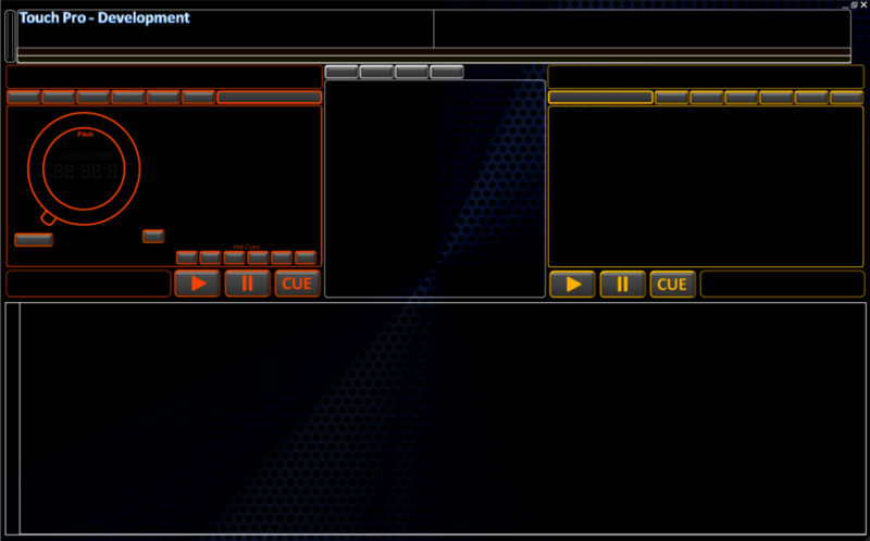

Posted Mon 20 Apr 09 @ 3:40 pm
Looking good djtouchdan =)
Posted Mon 20 Apr 09 @ 3:45 pm
wonder what you think of this idea dan, you have four oblong boxes above the centre panel how about running twelve of those left to right just above the browser window for samples/effects, would be a great help to people that like to do sample drops throughout the night, just a pity we can't have more than the twelve working though...
Posted Mon 20 Apr 09 @ 5:49 pm
something like this tayla??
Might make it switchable between effects, samples and clipbank.
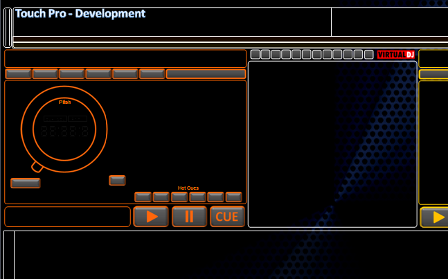
Might make it switchable between effects, samples and clipbank.

Posted Mon 20 Apr 09 @ 6:05 pm
i was thinking more along the lines of the browser (white box) and the deck functions, so they are large enough that they can be named, about the size of the original pic...
that sounds good as well them been switchable.... will then need to definately have them large enough so they can be tagged.
that sounds good as well them been switchable.... will then need to definately have them large enough so they can be tagged.
Posted Mon 20 Apr 09 @ 6:46 pm
ah ok i'm with you - i clearly didnt read your original post.
Will play around with it tomorrow - off to count some sheep now!! lol
Will play around with it tomorrow - off to count some sheep now!! lol
Posted Mon 20 Apr 09 @ 6:48 pm
ok mate, same here, if you read this thread i posted on from a while back this is something along the lines that i'm really looking for, you just jogged my memory with mentioning the different banks you can make available, anyway see what you think....
http://www.virtualdj.com/forums/100635/Wishes_and_new_features/%3Cspan%20style=
http://www.virtualdj.com/forums/100635/Wishes_and_new_features/%3Cspan%20style=
Posted Mon 20 Apr 09 @ 6:56 pm
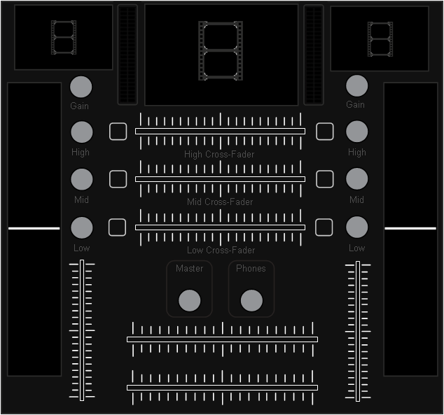
It's ok, i'm alive.....just......lol. Been ridiculously busy with work - haven't had time to do anything since the last update but did get some time this evening to do some more graphic work. Focused on the mixers and below is the screenshots to tease you all ;)
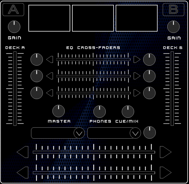
Screenshot 1
Aimed at audio only jocks featuring the much requested and now seemingly much loved EQ crossfaders. Also included headphone volume and "mix" levels (as requested) - not completed yet.
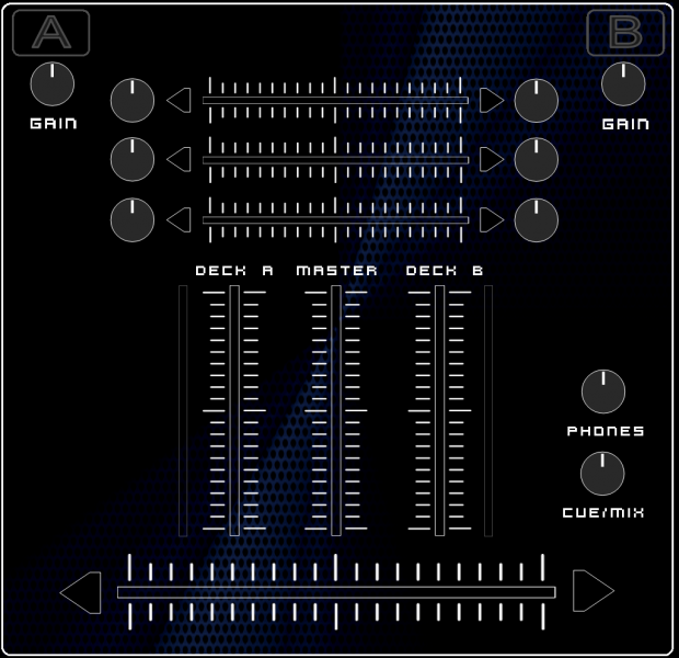
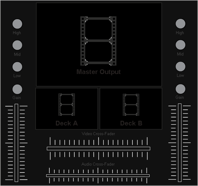
Screenshot 2
Video, Video, Video. Large master output and two smaller visuals. Might change these slightly or add something else as their will be video pannel options in the Deck pannels to - possibly have it switchable to a "clipbank" bank :)
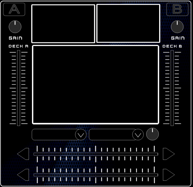
Screenshot 3
The best of both worlds - everything from the audio mixer and the video mixer combined (obviously the screens are smaller).
Am hoping to do some more work over the next week so will post some screenshots of the overall skin when i have done some more.
As always feel free to comment and post suggestions if you think i have missed something that should be there. Thanks =)
Screenshot 1
Aimed at audio only jocks featuring the much requested and now seemingly much loved EQ crossfaders. Also included headphone volume and "mix" levels (as requested) - not completed yet.

Screenshot 2
Video, Video, Video. Large master output and two smaller visuals. Might change these slightly or add something else as their will be video pannel options in the Deck pannels to - possibly have it switchable to a "clipbank" bank :)

Screenshot 3
The best of both worlds - everything from the audio mixer and the video mixer combined (obviously the screens are smaller).

Am hoping to do some more work over the next week so will post some screenshots of the overall skin when i have done some more.
As always feel free to comment and post suggestions if you think i have missed something that should be there. Thanks =)
Posted Thu 07 May 09 @ 6:33 pm
Hey Dan, that looks really nice mate.
I am not sure about the orange and yellow on this one though, it think it looks a bit "glowy", as in too bright, more the orange though.
Hard to say though without seeing the whole layout.
I really like the look of the pics in your last post, it has a very professional almost metallic look to it with the "hole pattern" blue swirl in the background.
Maybe try some metallic looking colors(as opposed to orange/yellow) like silver, grey, copper, bronze...dunno really, stupid idea probably, I did fail art at school...just an idea but I like what you have done.
Keep up the good work mate.
Matt.
Posted Thu 07 May 09 @ 7:30 pm
yeah yeah yeah, busy busy busy, alright already, your breaking your momma's heart, no consideration for others... lol
looking good...
looking good...
Posted Fri 08 May 09 @ 1:16 am
Very nice Dan, as always
Posted Fri 08 May 09 @ 3:03 am
i like the best of both worlds view for the mixer and video in one.
keep the work going, looking good so far.
keep the work going, looking good so far.
Posted Sat 09 May 09 @ 12:48 pm
very nice !
Posted Sun 10 May 09 @ 4:01 pm
wow!!so amazing
Posted Wed 13 May 09 @ 10:57 am
Dan what size monitor and resolution are u usin to create this??? If u are tryin to create a true touch skin PLEASE try to use the buttons with your fingers and such. If u need my help let me know I run a 17" touchscreen with a res of 1280X1024.
Posted Fri 15 May 09 @ 4:26 am
discobrian24 wrote :
Dan what size monitor and resolution are u usin to create this??? If u are tryin to create a true touch skin PLEASE try to use the buttons with your fingers and such. If u need my help let me know I run a 17" touchscreen with a res of 1280X1024.
Hey brian, I seem to have made this some what confusing. It isnt a "touchscreen" skin. I merely used my DJ name "DJ Touch" lol.
However i do have a touch screen skin in the pipe line but have had nothing but head aches at work - got ram raided the over day so been cleaning the aftermath up - lol.
Never mind.
Posted Fri 15 May 09 @ 8:25 am
discobrian24 wrote :
Dan what size monitor and resolution are u usin to create this??? If u are tryin to create a true touch skin PLEASE try to use the buttons with your fingers and such. If u need my help let me know I run a 17" touchscreen with a res of 1280X1024.
17in should be the minimum. I have a 19inch, but it cost a bomb off of Ebay.
I'm working on a skin for a touchscreen net book at the minute. see the other topic in skins by XStatic.
but im still looking out for a good 'touchable' skin for a 1280x1024 monitor. not everyone uses laptops. lol
Posted Fri 15 May 09 @ 9:37 am
Virtual DJ 6 - well that has thrown up some more options!!
TouchDJV6 (formally TouchPro) is under serious redesign. As Supacon has done for VideoVision i want to open up to requests for features YOU want to see included.
Post below.......
TouchDJV6 (formally TouchPro) is under serious redesign. As Supacon has done for VideoVision i want to open up to requests for features YOU want to see included.
Post below.......
Posted Mon 01 Jun 09 @ 6:42 pm
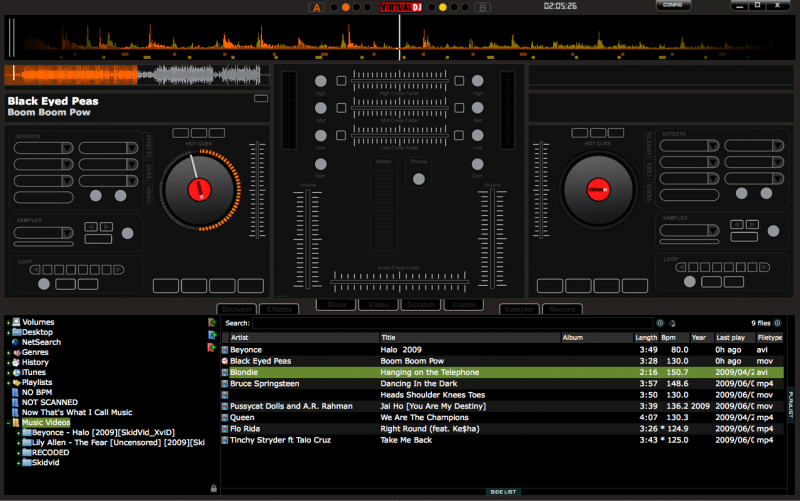
Sneak Peak =)
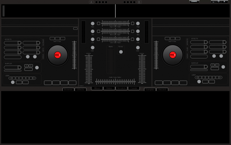
Skin overview: (low quality image as it wouldn't let me upload the original - too big :s)
Including channel video
Including EQ crossfaders
6 bank effects (Hercules compatible)
6 bank hot cues (and 3 fast hot hues)
And everything for the default V6 skin.
Video mixer - need to add video effect and transition options to this one
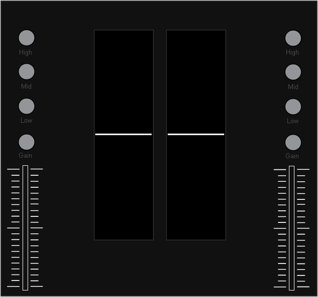
Scratch mixer - in development
Combination Mixer - all the best bits, video, scratch and mixer
Skin overview: (low quality image as it wouldn't let me upload the original - too big :s)
Including channel video
Including EQ crossfaders
6 bank effects (Hercules compatible)
6 bank hot cues (and 3 fast hot hues)
And everything for the default V6 skin.

Video mixer - need to add video effect and transition options to this one

Scratch mixer - in development

Combination Mixer - all the best bits, video, scratch and mixer

Posted Tue 02 Jun 09 @ 5:28 pm
Posted Tue 02 Jun 09 @ 8:06 pm


