yep you can use my logo (i didn't design it, i just like using it) no probs be quite chuffed if you did, actually think it will look good. agree with L2 about time wave box and the jog logo, i was going to mention them but thought i had asked enough of you, so i'm glad he brought it up, if would be better to judge if there was a chance of seeing both of the jog wheel effects side by side, what i would like to see if it was possible is the outer silver rim of the jog to have a pulsating effect circulating it, if you know what i'm trying to say.
Posted Wed 11 Feb 09 @ 4:36 pm
"Tayla" DJ logo replacing Virtual DJ logo on platter centres - DONE
Back ground to "Song Position" wave form changed to black - DONE
Beat effect added to edge of jog wheel - DONE (i have only done a very slight effect on this - which i actually think looks better)
Rotating "Numark-ish" graphics - NOT DONE - LOL i have decided to keep these as i actually quite like them and when i tried it with the grey circle (which i assume you meant to look like the finger "print" on the actual controller) - i didnt like it.
Other changes:
> Reverse Button added next to song position waveform
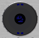
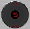
Screenshot of updated jog wheels:


More testing on Friday.
djtouchdan.........
Back ground to "Song Position" wave form changed to black - DONE
Beat effect added to edge of jog wheel - DONE (i have only done a very slight effect on this - which i actually think looks better)
Rotating "Numark-ish" graphics - NOT DONE - LOL i have decided to keep these as i actually quite like them and when i tried it with the grey circle (which i assume you meant to look like the finger "print" on the actual controller) - i didnt like it.
Other changes:
> Reverse Button added next to song position waveform
Screenshot of updated jog wheels:


More testing on Friday.
djtouchdan.........
Posted Wed 11 Feb 09 @ 8:05 pm
hey dan looking good, can't wait to see the effect on the rim, see you got the wall message... lol
Posted Thu 12 Feb 09 @ 5:28 am
:0 better looking!
I just dont like the dark blue on the black jog, it too hard to see, lighten the tone a few shades.
I am sure your a mac user but if you got rid of the apple O O O and make it more universal you would not have to make 2 versions.
I just dont like the dark blue on the black jog, it too hard to see, lighten the tone a few shades.
I am sure your a mac user but if you got rid of the apple O O O and make it more universal you would not have to make 2 versions.
Posted Thu 12 Feb 09 @ 10:04 am
listen2 wrote :
I just dont like the dark blue on the black jog, it too hard to see, lighten the tone a few shades.
I am sure your a mac user but if you got rid of the apple O O O and make it more universal you would not have to make 2 versions.
I just dont like the dark blue on the black jog, it too hard to see, lighten the tone a few shades.
I am sure your a mac user but if you got rid of the apple O O O and make it more universal you would not have to make 2 versions.
Glad you like the new jogs - the colour of the centre looks better on the actual skin than in these images. It also matches the text and spinners etc etc.
It isnt just the OOO that needs ammending between Apple and Windows - i have had issues with font sizes too on previous skins (before i understood how to make skins and edit the XML).
Therefore as a Mac user i have done a Mac design but am willing to make 2 minor graphical changes and the font changes for Windows users. ;)
A video update so you can see the jogs better:
djtouchdan......
Posted Thu 12 Feb 09 @ 7:24 pm


