jimmy b wrote :
Top class mate, top class
Is it going to be for PC or Mac or both?
Top class mate, top class
Is it going to be for PC or Mac or both?
Glad you like... lol
Mac at the moment - but will make the alterations for Windows users.
tayla wrote :
i'm well impressed, (the last time i said that was when jimmy had his legs waxed) and thank's for listening to the users... ooh i mean me. lol. never thought to ask do all the function buttons backlight to blue, do the audio/video crossfaders work jointly, got to ask someone needs to look dumb here... lol
excellent work dan.
excellent work dan.
Every single light is nice blue - the same as the default RMX skin.
The crossfaders work individually - but of course you can link the video crossfader via the settings menu so they both move jointly
__________
Also working on a 1440x900 version but will probably release the 1280x800 version soon and the larger version later.
Can't wait to get my hands on this bit of kit at the end of the month - lol
djtouchdan.....
Posted Mon 09 Feb 09 @ 2:42 pm
right, don't want to see you back here until a windows 1400 x 900 is completed, going on your past work that will be just a little after ten tonight, now get on with it.... lol
once again, nice work dan.
once again, nice work dan.
Posted Mon 09 Feb 09 @ 3:00 pm
forgot to mention it's gonna look even better with it's own skin...
Posted Mon 09 Feb 09 @ 3:02 pm
tayla wrote :
right, don't want to see you back here until a windows 1400 x 900 is completed, going on your past work that will be just a little after ten tonight, now get on with it.... lol
once again, nice work dan.
once again, nice work dan.
ever the comedian!! lol
Will try to have the follow versions up by the weekend:
Mac - 1280x800
1440x900
Win - 1280x800
1440x900
Posted Mon 09 Feb 09 @ 3:05 pm
jeez i was only kidding, don't want to burn you out... just forget the mac stuff, jimmy and me should be okay otherwise
Posted Mon 09 Feb 09 @ 3:38 pm
@ djtouchdan
Please have a look in the XML of the Hercules RMX & Steel v2.0 to make compatible your skin with RMX and also with Steel multi buttons.
http://www.virtualdj.com/addons/4554/Hercules_RMX___Steel.html
Please have a look in the XML of the Hercules RMX & Steel v2.0 to make compatible your skin with RMX and also with Steel multi buttons.
http://www.virtualdj.com/addons/4554/Hercules_RMX___Steel.html
Posted Mon 09 Feb 09 @ 3:41 pm
@ cioce
Not sure what you need me to do. The basis for my video skin was the hercules RMX skin.
Is there something specific you are getting at??
Not sure what you need me to do. The basis for my video skin was the hercules RMX skin.
Is there something specific you are getting at??
Posted Mon 09 Feb 09 @ 4:13 pm
Put more attention on pannel related on "djc" 11, 12 ,21 and 22
It's important to make a compatibility with RMX and Steel 6+6 buttons.
<pannel id="11" group="1" visible="djc11">
<size width="104" height="177"/>
<pos x="297" y="167"/>
</pannel>
ecc ecc ecc
It's important to make a compatibility with RMX and Steel 6+6 buttons.
<pannel id="11" group="1" visible="djc11">
<size width="104" height="177"/>
<pos x="297" y="167"/>
</pannel>
ecc ecc ecc
Posted Mon 09 Feb 09 @ 4:26 pm
Ah i see - to the best of my knowledge i have implemented the same Pannels as in the original - so it should be fine.
Thanks for the tip though.
Thanks for the tip though.
Posted Mon 09 Feb 09 @ 6:47 pm
wow, this guy is good.
Posted Tue 10 Feb 09 @ 12:40 am
awesome man... i like it
Posted Tue 10 Feb 09 @ 4:19 pm
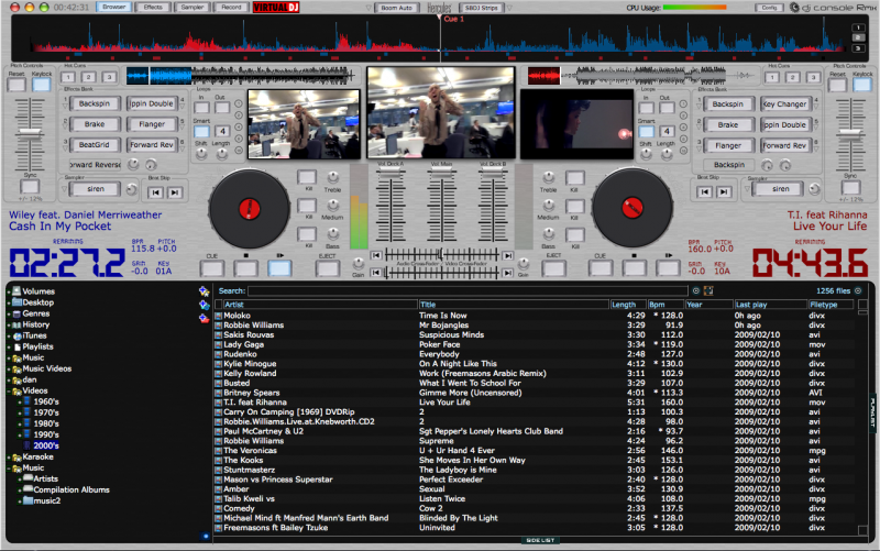
Following some hefty bug fixing and a re-design i thought i would upload a few more screen shots for you,
your thoughts, as always, are welcome.
**********************************
RMX_Video_Mac Version - Overview:
**********************************
Windows Version (changes)


**********************************
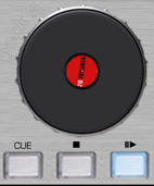
New jog wheel (centre spins - scratch control as you would expect)
**********************************
New VU meter - it blends more into the skin - but is also still visible and clear

**********************************
Updated CPU meter to reflect this

**********************************
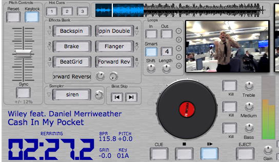
Up close and personal with Deck A......
**********************************
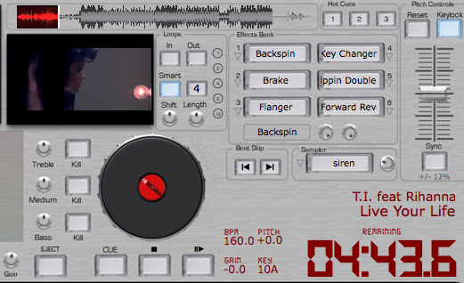
and Deck B.......
**********************************
Hope everyone likes it!!!
Should have the 1280x800 version for BOTH Windows and Mac up pretty soon.
djtouchdan..........
your thoughts, as always, are welcome.
**********************************
RMX_Video_Mac Version - Overview:

**********************************
Windows Version (changes)


**********************************
New jog wheel (centre spins - scratch control as you would expect)

**********************************
New VU meter - it blends more into the skin - but is also still visible and clear

**********************************
Updated CPU meter to reflect this

**********************************
Up close and personal with Deck A......

**********************************
and Deck B.......

**********************************
Hope everyone likes it!!!
Should have the 1280x800 version for BOTH Windows and Mac up pretty soon.
djtouchdan..........
Posted Tue 10 Feb 09 @ 6:55 pm
Simply amazing mate!!!!!!
You've got every detail of the RMX, stop on!!!!
Posted Tue 10 Feb 09 @ 7:05 pm
just absolutely love what you have done but... not been a scratcher i prefer the original mac version to where you now have the jog wheels and understand where your coming from with it but i like the effect of the others, unless of course you can some how get the same effect on the outer rim of the jogs, just my thoughts, anyway... great work.
Posted Tue 10 Feb 09 @ 7:10 pm
tayla wrote :
just absolutely love what you have done but... not been a scratcher i prefer the original mac version to where you now have the jog wheels and understand where your coming from with it but i like the effect of the others, unless of course you can some how get the same effect on the outer rim of the jogs, just my thoughts, anyway... great work.
Is this what you had in mind?

djtouchdan......
Posted Tue 10 Feb 09 @ 8:44 pm
bloody hell it's like having a magic lantern... right my next wish, jennifer and christine completly nu..
great, thanks dan, how does the movement look on it to you?
great, thanks dan, how does the movement look on it to you?
Posted Wed 11 Feb 09 @ 2:34 am
Take a look at this slightly blurry video.
Edit by Cioce
BBcode for youtube added / thanks mate -djtouchdan...
Posted Wed 11 Feb 09 @ 5:40 am


