I think the font on the cue buttons doesn't look so good.
Posted Sat 20 Dec 08 @ 1:57 pm
I agree but compared to the other nasty fonts i used they were the best so far :) i will try some more.
Posted Sun 21 Dec 08 @ 8:36 am
any chance you can put buttons to adjust cbgs and show cpu usage meter or just the percentage of it, and maybe an effects button
as a suggestion, you can squeeze the adjust cbg and cpu usage on top where the title of the skin is
:)
as a suggestion, you can squeeze the adjust cbg and cpu usage on top where the title of the skin is
:)
Posted Sun 21 Dec 08 @ 12:04 pm
I could add CBG buttons but i use shortcuts and they work great!! So i may or may not add them. I will add CPU%. Everything can be done just keep making suggestions, that helps a lot when designing.
Posted Sun 21 Dec 08 @ 2:28 pm
can anybody help me i am new to VDJ and had a little gig this morning and my cpu bar went into the red nothing happened but what does that mean and how can i correct the problem?
Posted Sun 21 Dec 08 @ 9:16 pm
please make sure you post in the proper forum so someone can help you, this forum is for SKINS.
Posted Sun 21 Dec 08 @ 9:31 pm
I will rethink the hot cue buttons fonts and maybe size ;) i am also going to move the top items down closer to the red, which will look better plus give me some more top console space to add things. Overall I think i am liking the project, still its great to hear feedback while i develop ideas rather then after. :) it makes less work.
Posted Mon 22 Dec 08 @ 2:47 pm
thanks listen2
give us another preview whenever your done with new adjustments.
thanks again
give us another preview whenever your done with new adjustments.
thanks again
Posted Mon 22 Dec 08 @ 4:05 pm
IMO you could make the waveforms smaller slightly and make some room between the decks and the wave forms so you have something like this...
waveform a / play stop cue / spinny deck
cbg a / cue1 cue2 cue3 / "
waveform b / play stop cue / spinny deck
cbg b / cue1 cue2 cue3 / "
this could leave more room for the browser (search) (although i use the skin resiser to make the browser font smaller to give me moew room there) hehe
if i had paint.net, i could show you what im thinking of, but i think the above will do :)
Posted Mon 22 Dec 08 @ 8:43 pm
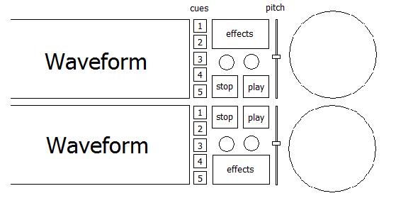
i like marksmolinskis idea about the waveforms to be smaller, but i was thinking they could be shorter and make room for a few buttons between the waveforms and the disk spinners. i think theres no need for the waveforms to be that long especially on a widescreen skin. i did do a little drawing of what im speaking of, just some basic drawing

if its too messy there, then maybe you can just leave the cues and the pitch sliders

if its too messy there, then maybe you can just leave the cues and the pitch sliders
Posted Tue 23 Dec 08 @ 4:39 am
Cool drawing!
sometimes the best to describe something is with pictures.
The idea is to have less on the screen since if your using hardware or a controller. The effects button does not need to be added since you have a effects tab that does the same thing, the only that might need to be added would be the parameter knobs (1 - 2) for the effects.
The pitch sliders i think i will add but at the top, since making the top wave section lower it will give me more space. I also like the pitch sliders horizontal since it reminds me of a turntable sideways :)
The Cue's i thought were pretty good if i can settle on a good font, how many cue points does one really need? 3 is not enough? I don't like to use too small buttons so things are easier to select and less room for mistakes, when using a touchpad.
Stop and play buttons are also not needed if you using hardware or a controller. the idea is to make something very useful but as simple as possible. There are many skins already made ranging from simple to complex, but what i try to think when i design something is "how can i make VDJ better and more useful"? I admit most of what i create is only for timecode or controller users but sometimes we get ahead of ourselves and forget the most basic elements.
Keep the ideas coming... it's great to have some creative input.
**how come no one noticed my taskbar has icons only ;) nor is it Vista.
Posted Tue 23 Dec 08 @ 9:03 am
listen2 wrote :
**how come no one noticed my taskbar has icons only ;) nor is it Vista.
Clever that is, I like just Icons, is it a plugin mate.
Posted Tue 23 Dec 08 @ 10:06 am
listen2 wrote :
**how come no one noticed my taskbar has icons only ;) nor is it Vista.
That a winXp mod? Could you show us what it is, it would
save a lot of space down there... :)
Posted Tue 23 Dec 08 @ 2:21 pm
Its Windows 7.
the give away for me is the small box on the right hand side of the clock that could be used to minimise all open windows.
the give away for me is the small box on the right hand side of the clock that could be used to minimise all open windows.
Posted Tue 23 Dec 08 @ 7:50 pm
No.... its windows XP. Wait until you see it now :)
Yes it does save a lot of clutter, i really like the tasks being grouped as a default rather then grouping after the taskbar runs out of space. Now i got a little bigger taskbar and bigger task buttons. i think it makes things much better. I can post some tricks I have for XP in another thread if you guys are interested.
Oh and .....
I'll have a new preview of the skin soon
Posted Wed 24 Dec 08 @ 12:32 pm
Listen2,
I've managed to get my 2 XP machine's to do it now, just messed around with the reg values abit this afternoon. My Vista gig laptop looks sweet too with just Icons.
Cheers mate.
Posted Wed 24 Dec 08 @ 12:44 pm
listen2 wrote :
Yes it does save a lot of clutter, i really like the tasks being grouped as a default rather then grouping after the taskbar runs out of space. Now i got a little bigger taskbar and bigger task buttons. i think it makes things much better. I can post some tricks I have for XP in another thread if you guys are interested.
Definitely interested. Especially if it's a reliable software that can be installed/uninstalled normally
without worrying on having some shit installed with it than might eventually fu*k up the system :D
That your software? Or some opensource mod? The latter would be great. =)
Posted Wed 24 Dec 08 @ 2:06 pm
it's a real simple reg edit that can be simply done and undone as you wish with no system problems. I sent you a PM ;)
Posted Wed 24 Dec 08 @ 2:30 pm
Even better! 
Posted Wed 24 Dec 08 @ 3:41 pm
Very excited about this skin as well. I love the simple layout. I also really love erdi's additions.
Would it be possible to have an option of not using the "radar style" platter and possibly something similar to the mixlab circle platters? I am not a vinyl guy and generally not a fan of the "vinyl emulation" look. But hey, that's only my opinion.
Looks great so far!
Can't wait to see it in action.
Posted Fri 26 Dec 08 @ 10:12 am


